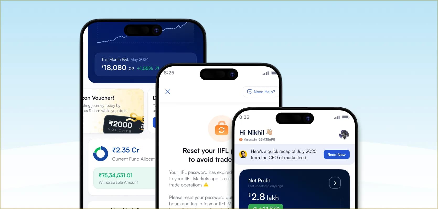

Pledge Transparency
Q1 2025 · Product Designer · designed from scratch
marketfeed · iOS / Android
An in-app view of how much is pledged, and an easy way to track it.
Team
 Parvez Musharraf (Product Manager)
 Nikhil DS (Product Designer)
Problem
In marketfeed Automated Trading, pledging is what unlocks the second return stream. Users put capital into Investment Baskets for stable long-term returns, then pledge those baskets to unlock 90% margin, which marketfeed’s automation trades in weekly options. The same money earns twice.
By early 2025, 56% of platform AUM sat in pledged funds. Pledging was not a niche behaviour, it was the dominant way users actually used the product.
But pledge state lived nowhere in the app. A user who had pledged ₹3.6 lakh of their basket could not see how much was pledged, how it split across cash and non-cash collateral, whether their pledge ratio was safe, or how much they could withdraw without breaking their setup. Every one of those questions went through a Relationship Manager.
The RM team answered those questions during business hours. After that, users waited until morning. Internal data showed pledge questions were about 10% of weekly RM inbound chats, and most of them were the same few questions asked again. Users were waiting on a person to read them numbers a screen could show.
Design
1. Pledge ratio
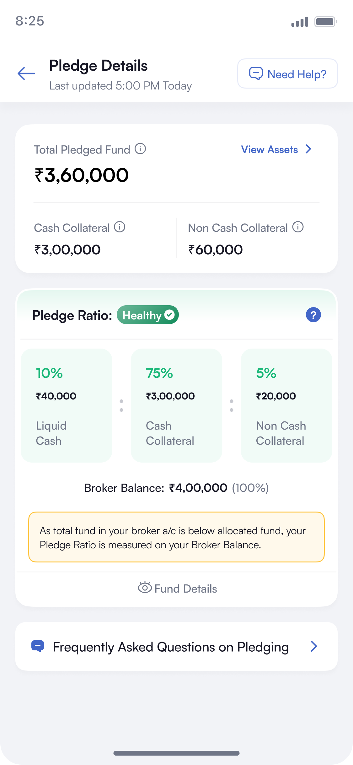
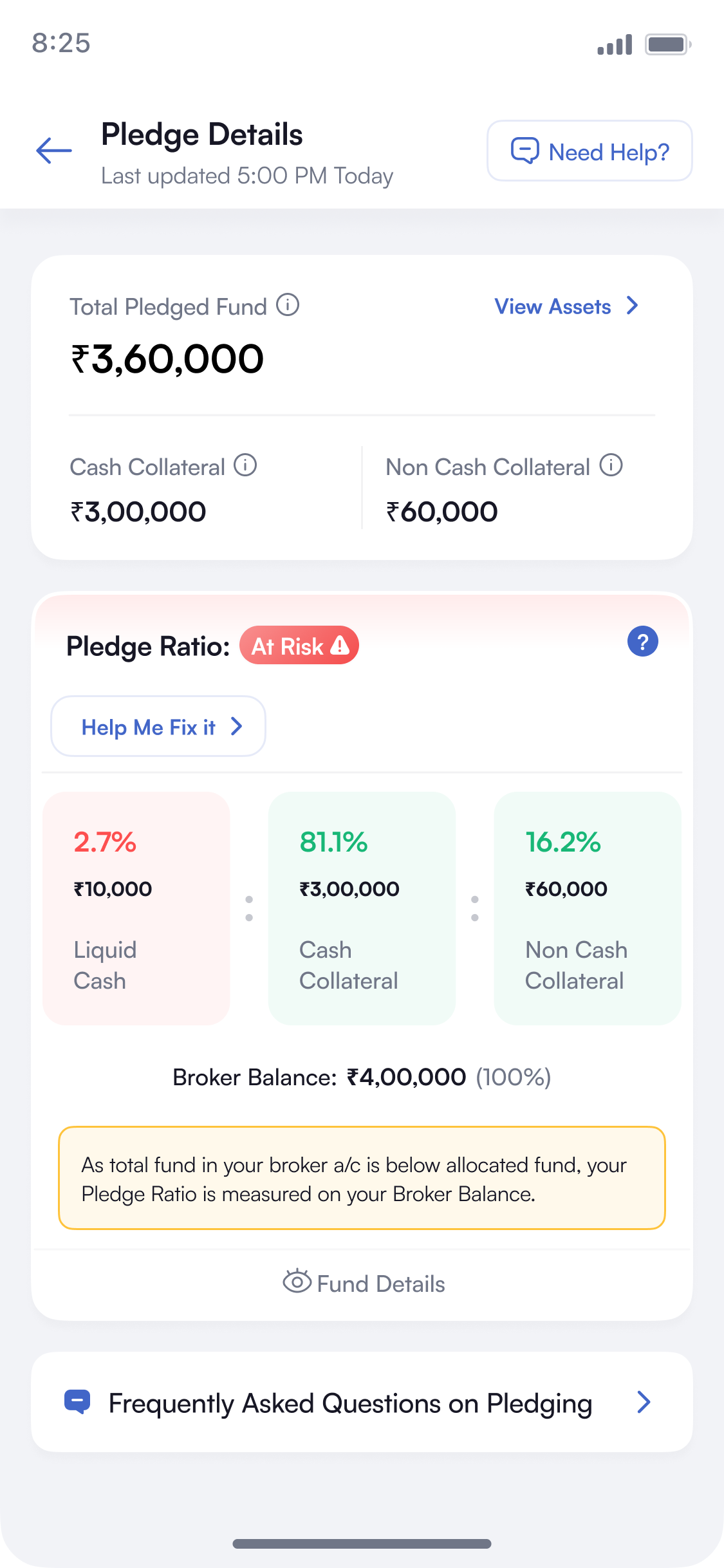
HealthyLiquid Cash at or above 10%, non-cash below 40%. Trades run as normal and nothing is charged, so the screen stays informational and surfaces no action.
A percentage does not tell a user whether to act. So the ratio is shown as a state first — Healthy / Weak / At Risk — and the state pill sits above the numbers on every pledge view. State first, then the numbers: percentages and rupee values together.
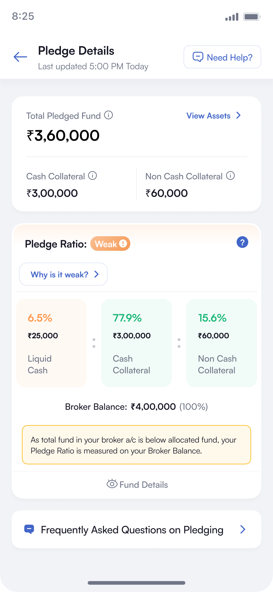
A user who sees Healthy, Weak or At Risk still does not know why. So the ratio is broken into the three parts that decide it — Liquid Cash, Cash Collateral, Non-Cash Collateral — each showing its own percentage and rupee value. The part that crossed its limit is the one coloured, so the state explains itself.
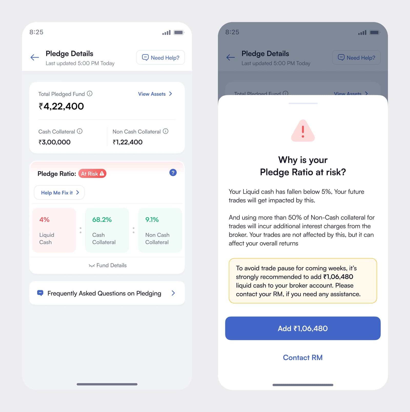
Two thresholds decide the state, not one. Healthy is Liquid Cash at or above 10% and non-cash below 40%. Weak is Liquid Cash between 5% and 10%, or non-cash above 40%. At Risk is Liquid Cash below 5%. The two also cost different things: low liquid cash can pause trades, heavy non-cash use adds broker interest. The explainer states both rules in plain words instead of showing a formula.
Every state had to work in two conditions. Each flow was designed twice: once normally, and once at fund shortage, when the broker balance has fallen below the allocated fund.
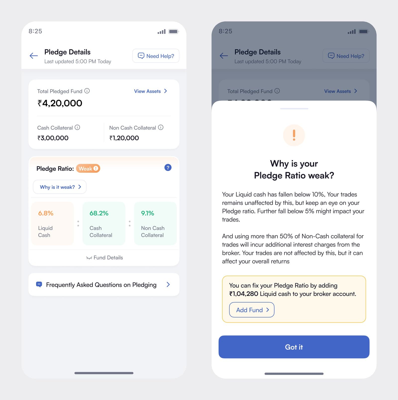
WeakOpens from a question: “Why is it weak?” Trades are fine for now, so the fix stays a small outline button and the primary button says “Got it.”
2. Pledge details
These users do not browse, they check. Most open the app, look at one number and close it. A single dense dashboard, which is the usual fintech answer, would not have worked for them.
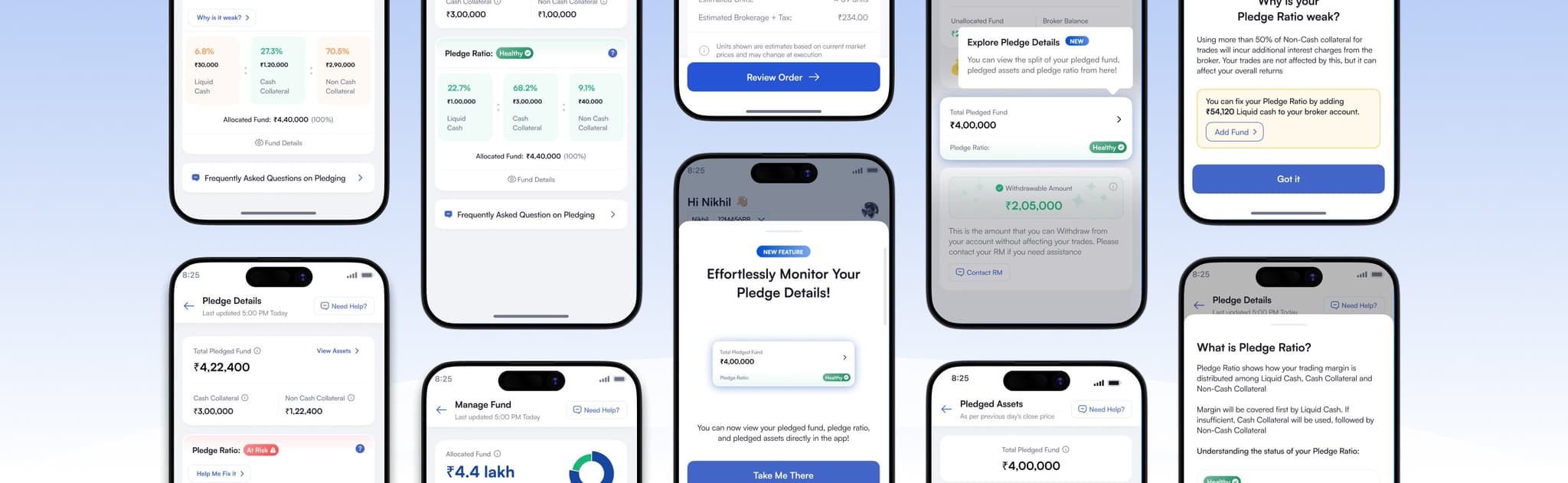
So the screens are layered. Manage Fund shows the Total Pledged Fund and the state pill, nothing more. One tap in, Pledge Details shows the cash and non-cash split and the three parts. One more tap, Pledged Assets shows the holdings themselves, each row with the haircut the broker applies and the margin it actually gives.
3. Onboarding
The feature explains itself on first open. It went live for users who had been pledging for months and for users who had never seen a pledge screen, so both needed the same context. A launch modal offers Take Me There or Discover Later, a NEW badge marks the ratio, and a short tour defines each term where it appears.
4. Components
The ratio card was built as a component, not a screen. It carries the rules that keep it working on real data: text truncates past a set width, alignment changes with the size of the number so a figure in crores does not push the layout out, touch areas are defined, and there are empty and no-data states for accounts with nothing pledged yet. Building it once meant the states could be checked against each other instead of drawn one at a time.
5. Relationship manager
The obvious move here is to replace the RM call. That would have been wrong. These users value having a person to call, and taking that away reads as less service, not more.
So the app was added alongside the RM, not in front of them. Need Help? stays in the header of every screen, and Contact RM sits wherever a number might raise a question — under the withdrawable amount, and beneath the At Risk remedy. The screens answer the routine questions instantly and keep the person one tap away for everything else.
The same applies at the other end. The remedy button does not try to move money inside marketfeed, it hands off to the broker’s app, which owns that transaction. The RM keeps the conversation, the broker keeps the money movement, and marketfeed takes the part nobody had: the explanation.
Details
An eye icon hides every rupee value on the screen. These users check their portfolio in meetings, airports and cafes, where the numbers get read by people who should not be reading them.
The ratio is normally measured against the allocated fund. If the broker balance falls below that, it is measured against the broker balance instead, and an amber note on the screen says so. Without it the percentages would change on their own and look like a bug.
The FAQ sits at the bottom of every pledge view. Most of the RM pledge chats were the same small set of questions, so answering them on the screen is what actually brought the query volume down.
Outcome
~80% reduction in RM pledge-detail queries — a rough internal estimate from the RM team, against pledge questions that had been about 10% of weekly inbound chats.
The first in-app surface for the behaviour driving 56% of platform AUM, designed from scratch with no prior screens to work from. The app now answers the repeated questions, so the RM team spends its time on the ones that need a person.
What's Next
Banner System

In-app banners for the updates users need to see.