
Banner System
Q4 2024 · Product Designer · designed from scratch
marketfeed · iOS / Android
In-app banners for the updates users need to see.
Team
 Parvez Musharraf (Product Manager)
 Nikhil DS (Product Designer)
Problem
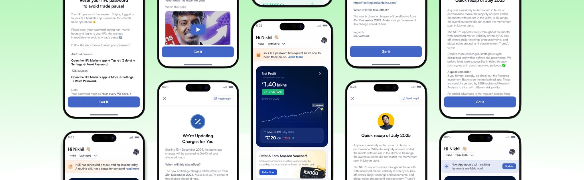
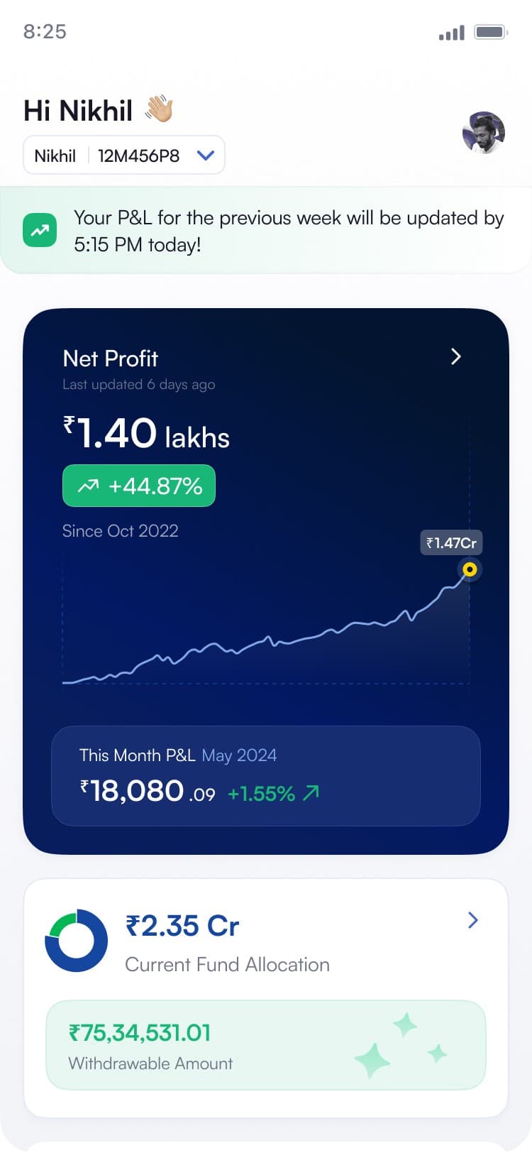
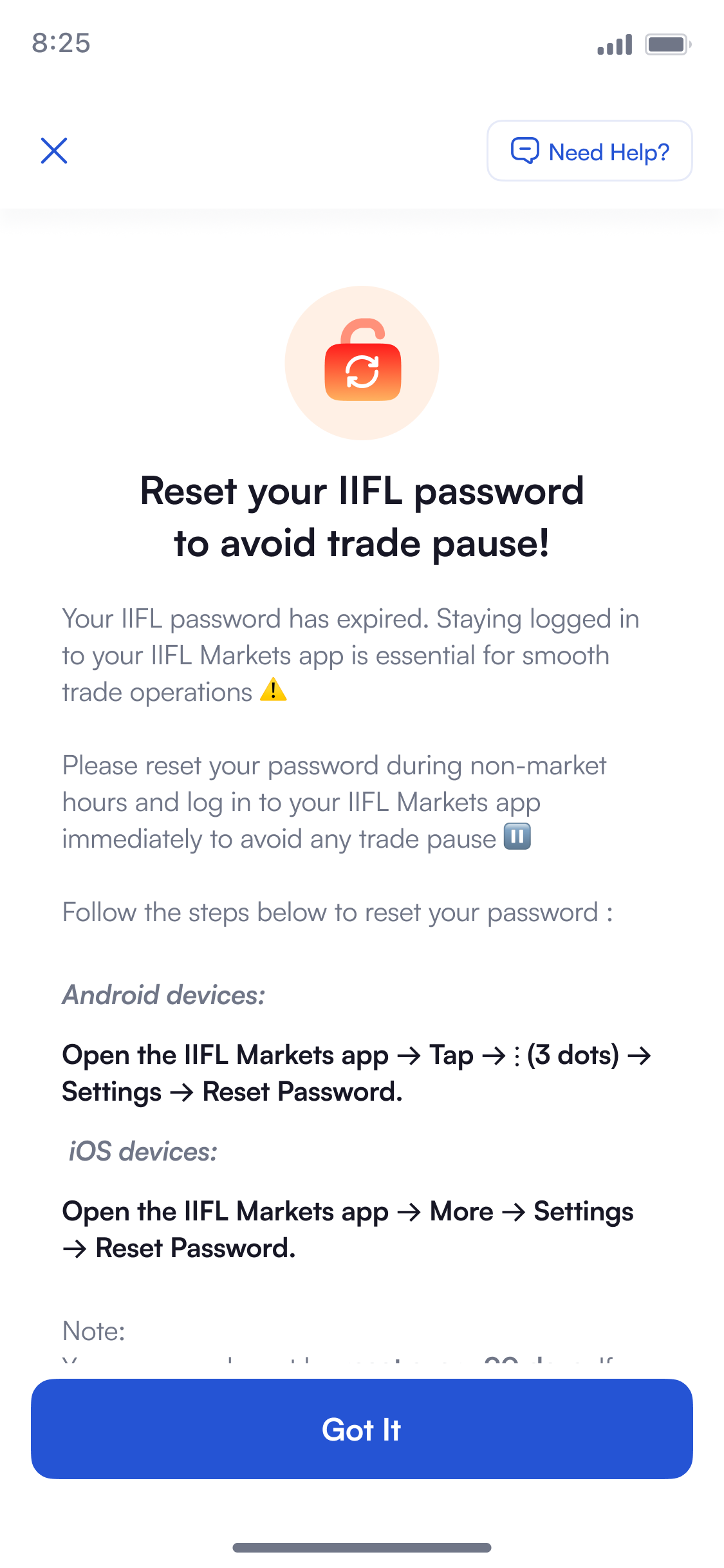
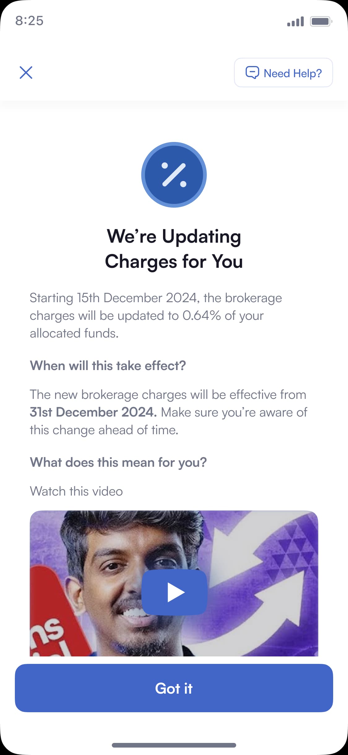
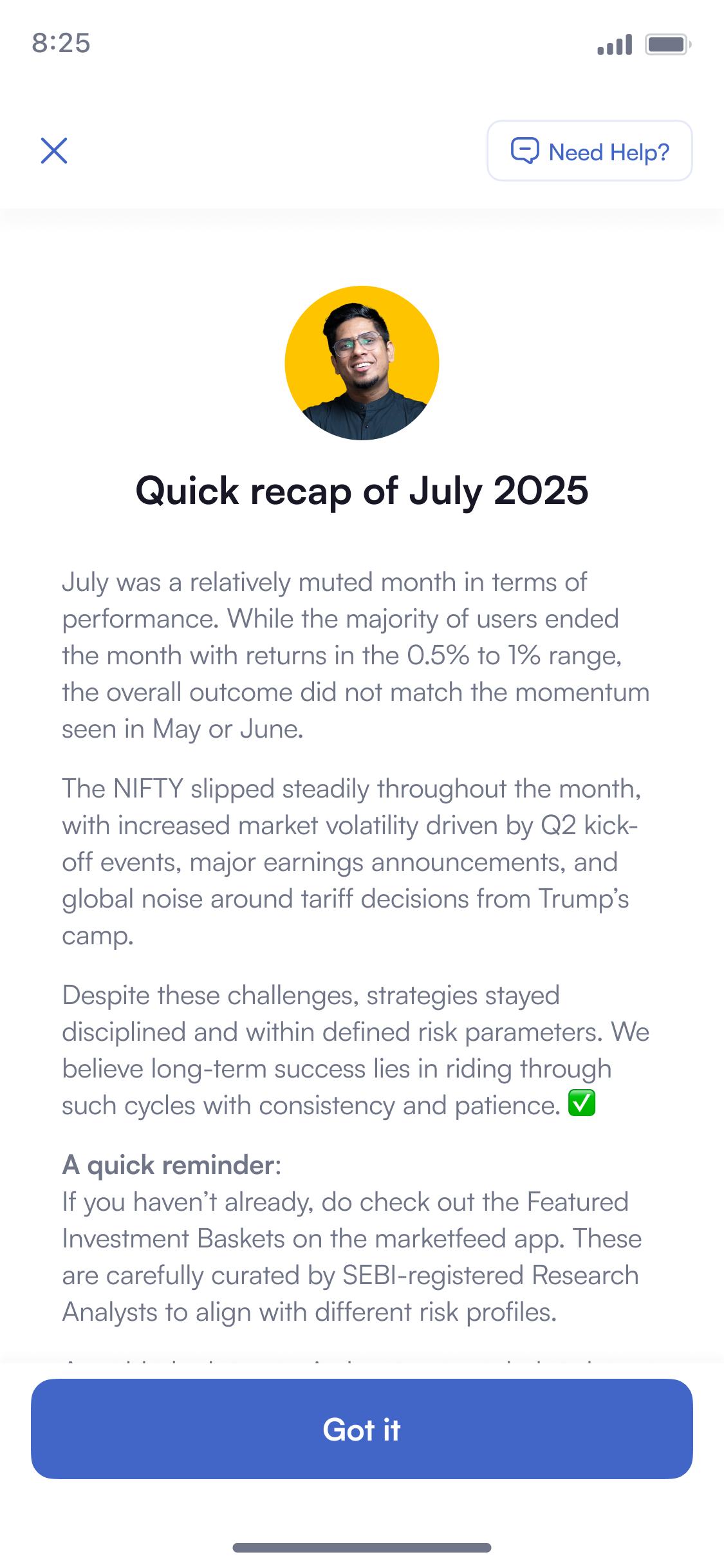
A fintech product managing ₹330 Cr of other people's money has a constant stream of things it must tell users, and almost none of them are marketing. A broker password expiring that will pause trades. An exchange running a mock session that will look alarming in the P&L. Brokerage charges changing on a specific date. A monthly performance note from the CEO after a flat month.
These arrive at different cadences, from different owners, with different urgency, and they never stop.
The problem was not any single banner. It was that each one was being designed, and the volume made that untenable.
Design
1. Formats
The top banner carries one message at a time. It sits at 343px, holds the slot on its own, and is where anything with a consequence goes — the user should not have to wait for a rotation to see it.
The carousel lets several messages share one slot. Cards are 330px and rotate on a 3-second loop, so a feedback request, a referral offer and a fund-requirement notice can queue instead of each asking for its own place on the dashboard.
2. Anatomy
The top banner is one component with four variants. One line, two lines, two lines with a text link, and two lines with a filled button. Copy longer than the box truncates rather than pushing the layout, so a message the comms team writes long still renders as a banner.
The call to action has two roles. A text link for read more, which opens the detail page, and a filled button for an action the user takes now. The button label is capped at 10 characters so it never wraps or squeezes the copy beside it.
Three tints, fixed by hex. Informational green, neutral blue, critical amber. Naming them in the spec is what stops the tint drifting once someone else is publishing the banners.
The carousel card is built from three layers: the text block, the background image, and the card they sit on. Across device widths only the image stretches and shifts — every other parameter stays fixed, so one card renders correctly on any screen without a second design.
3. Call to action
Every banner starts as a push notification. Lock screen, then the dashboard banner, then the destination. The banner is the same message the notification opened with, waiting for a user who did not tap it.
Three configurations, by how much the user has to do. A secondary CTA alone opens a detail page to read. A primary CTA alone goes straight to the action. Both when there is something to read and something to do, as on the minimum-fund notice.
4. Types
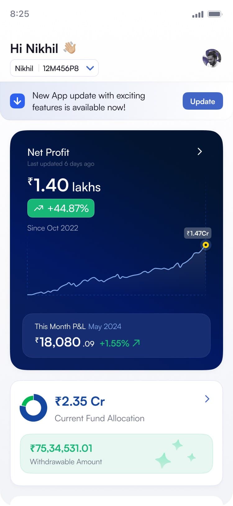
Three types, one component. The tint, the leading icon and the call to action change together; the layout does not. Critical is amber and carries a read more link. Operational is blue and carries a filled button. Informational is green and carries no action at all.
A user reads the hierarchy before they read a word, which matters when the same strip carries your trades will pause and here is a monthly recap.
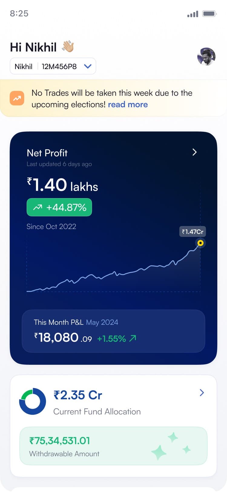
CriticalAmber, with a read more link. Trading stops this week, so the account behaves differently and the user needs the reason.
5. Detail page
One template, whatever the comms team writes. Shared chrome — close top-left, a persistent Need Help? top-right, a circular hero visual carrying the type through from the banner, then the body.
It accepts three kinds of content: links and docs, video, and images. Images enlarge on tap into their own view. Video and image both ship loading, not-found and reload states.
The Got it button is sticky. Length is unbounded, so body copy scrolls behind it and the dismiss is always reachable. A comms team that cannot break the layout does not need a designer in the loop.
Details
Need Help? travels with the content. The detail page keeps the same persistent RM access as the pledge surfaces. A banner saying trades may pause is exactly when a user wants a person, so the escape hatch sits in the header rather than at the end of the copy.
The detail page has more than paragraphs for a reason. Video, images, links and highlighted text are all available to the author because a banner often ends in something the user has to do, and a set of steps is easier to follow when it can be shown rather than described.
Outcome
55–60 banners published on one system — two formats, three types, three call-to-action configurations, and a detail page that takes links, video or images. No per-banner design work after it shipped.
What's Next
marketfeed. Wealth
End-to-end
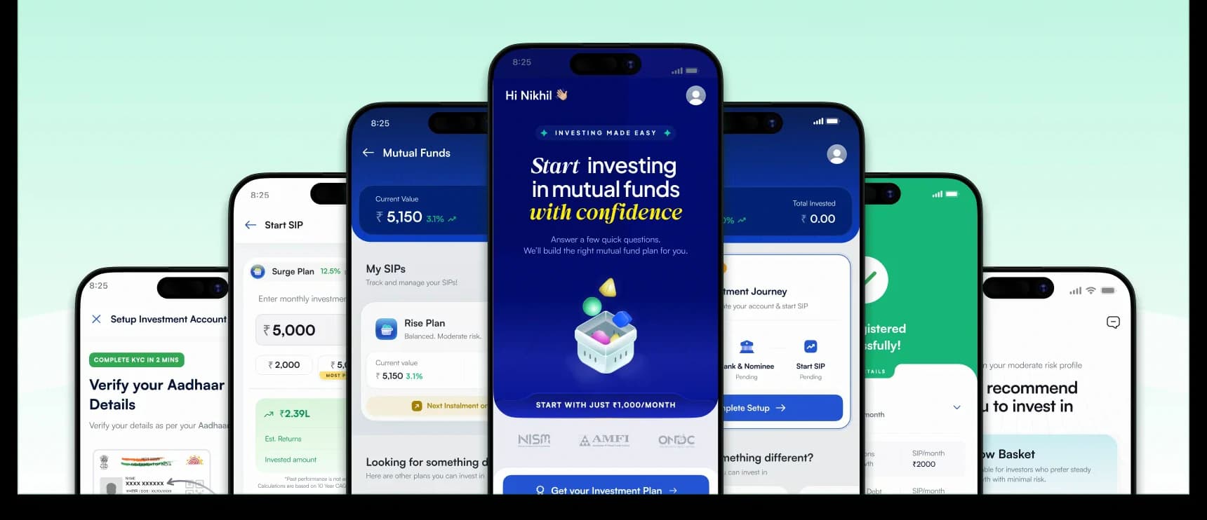
A 0→1 mutual fund product that opened marketfeed to a new audience of first-time investors, starting at ₹1,000, not ₹4 lakh.