Back to marketfeed

marketfeed. Wealth

May 2025 – Mar 2026 · Product Designer

marketfeed app (iOS / Android)

A 0→1 mutual fund product that opened marketfeed to a new audience of first-time investors, starting at ₹1,000, not ₹4 lakh.

Impact

~90%
Onboarding completion
2 min
Acc. opening time (95% autofilled)
250+
Signups
₹14L
Assets under management in beta

Role

Product Designer. Planned all seven flows end to end and owned the UI, the branding, and every icon and illustration in them.

Team

  • Sharique Samsudheen (CEO)
  • Sooraj E (CTO)
  • Vivek Krishna (Head of Design)
  • Nikhil DS (Product Design)
  • Smarak Das (Sr Engineer)
  • Ijas Ahammed (Front-end Developer)

Problem

The audience we were turning away

marketfeed's flagship product, Automated Trading, served 2,500 active users at a ₹4 lakh minimum ticket size. But the top of our funnel looked nothing like that: 2.3M+ YouTube subscribers and 741K+ on Instagram, mostly first-time investors with ₹1,000–₹10,000 to start. Feedback calls with our most active traders surfaced the same request repeatedly: manage our long-term wealth too. Users who trusted us with lakhs in trading wanted a place for the rest of their money, and the audience who couldn't afford trading wanted a way in.

Top of funnel2.3M YOUTUBE · 741K INSTAGRAM
₹4 lakh minimumEXISTING FUNNEL
Automated Trading2,500 active users
Start with ₹1,000NEW FUNNEL
BETA
marketfeed Wealth250+ signups · ₹14L+ invested
One audience, two ticket sizes. We had a product for the ₹4 lakh end and nothing at all for the other — Wealth is the new funnel, starting at ₹1,000.

Mutual funds closed both ends: SIPs from ₹1,000, regulated and trusted, and aligned with where Indian retail is heading under AMFI's Viksit Bharat 2047 vision.

The business model shaped every design decision

marketfeed Wealth earns ~0.6% commission p.a. on AUM through a regular-fund advisory model.

Constraints

  • One designer, nine months, seven flows — planning each flow end to end, then the UI, the branding, and every icon and illustration in it.
  • Regulated domain: question content, disclosure rules, and consent requirements owned by compliance/PMS, not design.
  • Two external vendors in the critical path — Decentro for KYC, Fintech Primitives as the mutual fund distributor — and either can fail mid-flow.

What actually got built

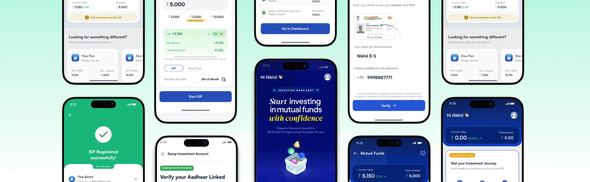
Before the decisions, the shape of the thing. Wealth is seven flows sitting inside an app that already existed, each one handing off to the next, and each one able to fail on somebody else's infrastructure. One pass through the shipped product, start to money moving:

Discovery0:00
0:00 / 2:04
Seven flows · nine months · one designer

Dashed pill — a handoff to a system we don’t control.

The whole product in one pass, and the seven flows it moves through. The first three are entirely ours; every one after hands off to a system we don't control — which is where §The unhappy path comes from.
  • Discovery — an in-app pitch page that explains what a plan is, what it costs, and who is behind it.
  • Risk profiling — six questions, one per screen, ending in an investment style.
  • Plan curation — the matched plan, its funds, its allocation, and the two you weren't matched to.
  • Account opening & KYC — PAN, address, income, declaration, bank, nominee, eSign.
  • Purchase — amount, mandate, OTP, registration.
  • Dashboard — portfolio when it works, recovery surface when it doesn't.
  • Redeem — standard, regulated, deliberately unremarkable.

The vendor layer is the part you can't see. Two external systems sit between a user and a registered SIP: Decentro for KYC and Fintech Primitives as the mutual fund distributor, with the AMC and fund data behind every number on screen. Either can time out, half-succeed, or return an error we don't control — which is why the last two sections of this study exist.

Design

Five chapters, in the order a user meets them. Each one is a problem, the options, what I shipped, and the board it came out of — all out of one component file, built as the flows were drawn.

1 · Getting in

The problem. The first screen was called Risk Assessment. People read that as a form to fill in, so they left before the product had shown them anything.

What I shipped. I renamed it Find your investment style and laid it out as 3 simple steps. Same six questions, same regulatory purpose — it just stopped sounding like work. ~90% of people who reach the intro now finish it.

The page behind the button. A first-time investor is deciding whether to trust us, not which fund to buy. So the intro is a full page, and it answers four questions in order: what a plan is, why us and not a broker, what it costs, and who is on the other end. On cost it shows ₹999 struck through, ₹0, then says plainly that we earn a commission from the fund house and it is already priced into the fund's returns. We make money on AUM. Saying so is better than being found out.

Trust gets built in a fixed order — what it is, why us, what it costs, who is behind it — and the commission is stated on the page rather than left to the disclosure at the bottom. Icons and illustrations are mine; the basket on the hero is a Rive animation.

Then the six questions. One per screen, clear progress, no scrolling form, ending in a result screen that names the style rather than scoring the user.

Six questions, one per screen, with the count visible the whole way. Compliance decided what the questions ask. I decided how many there are, how they are paced, and what the result screen says.

2 · Matching, not gating

Where the six questions land. They end in one of three investment styles, and each style maps to one plan: Conservative to Flow, Moderate to Rise, Aggressive to Surge. The app names the style, explains what it means, and takes the user straight to the plan built for it.

Product state
“You have a conservative investing style” result screen with a green seedling badge and low-risk characteristics

ConservativeMatched to Flow — safety over high returns, minimal risk exposure.

The three results a user can be matched to. Each one names the style, lists what it means in practice, and leads to a single plan.
Style result to matched plan. The other two plans sit at the bottom of the same page, under “Looking for something different?”.

The problem. That last part is where it gets difficult. Regulation requires us to show every plan to everyone — a Conservative user must be able to see Surge. So the profile can never be the only thing deciding what a user buys. Two obvious answers, both wrong:

  • Show everything and gate nothing. The profile becomes decoration, and someone buys risk they were just told to avoid.
  • Block anything that doesn't match. The profile becomes a cage, and people work around the product instead of using it.

What I shipped. Show all three plans, and put a consent step in front of any purchase that doesn't match the profile. A Conservative user can buy Surge — they just have to say so first. The profile sets the default; it doesn't make the decision.

The same page, three times. Every plan page carries the identical structure — recommendation, funds with expense ratio and allocation, the composition donut, why it suits your profile, who curated it, then the other two plans. Nothing is hidden from a Conservative user that an Aggressive user can see; only the recommendation changes.

Flow, Rise, Surge — one template, three risk tiers. Comparison happens in the list, so the decision doesn't require opening all three.

And the gate is a matrix, not a screen. Three mismatches are possible, and each sheet names both the profile the user was given and the plan they picked, so the consent is about their specific choice.

Conservative→Moderate, Conservative→Aggressive, Moderate→Aggressive. The sheet names the exact mismatch, so the consent is informed rather than reflexive.

Why it works both ways:

  • The regulator gets what it needs: every plan visible, and consent recorded at the exact point the risk transfers.
  • The user keeps the decision: friction sits on the risk choice itself, and nowhere else in the flow.

3 · Account opening: when the vendor is the design problem

The problem. Beta funnel data showed drop-off concentrated at one point: after plan discovery, at account opening. Users completed onboarding, finished risk profiling, found their plan, and died at KYC. Our vendor's (Fintech Primitives) KYC step was long, manual, and tiring, and no amount of screen-level polish on our side could fix a flow we didn't control.

Options considered.

  • Redesign our wrapper around the existing KYC flow → cosmetic; the fatigue was inside the vendor's steps.
  • Accept the drop-off as a cost of compliance → contradicted the entire retention-based business model.
  • Switch the KYC vendor post-launch → painful, but the only option that addressed the cause.
Before
Loginthe user arrives
drop-off concentrated here
Fintech PrimitivesKYC · manual, long
Fintech PrimitivesMF orders · SIPs · folios
Account openif they got through
After
Loginthe user arrives
DecentroKYC · ~2 min, 95% fetched
Fintech PrimitivesMF orders · SIPs · folios
Account open95% autofilled
One layer swapped, one kept. Decentro replaced the KYC step where the drop-off was; Fintech Primitives stayed underneath for orders, SIPs and folios, because that part was good.

What I shipped. In the months after launch, I used the beta drop-off data plus the design read on user fatigue to make the case to swap the KYC layer to Decentro, while keeping Fintech Primitives as the underlying MF infrastructure where it was strong.

Result: ~2-minute account opening, 95% of data autofilled from just a phone number.

Account opening after the switch to Decentro — the KYC handoff and the flow end to end, roughly two minutes with 95% of data autofilled from a phone number.

The vendor swap bought the data; the design decides what to do with it. A prefill of 95% is only worth something if the interface stops asking. So KYC isn't a form — it's four collapsed, already-ticked cards: Personal Details, Income, Address, Declaration. The label reads Review your pre-filled details, not Enter your details. The user's job is to confirm, not to type.

Ninety-five percent autofill only pays off if the screen stops asking. Four collapsed, pre-ticked cards — the user reviews and confirms instead of typing.

Then the 5%. A prefill system is only as good as its failure mode, and the fetch degrades in three distinct ways — no Aadhaar name and number, no personal/income/address/declaration, no bank details. Each tier keeps the same page and opens only what's missing, with the field marked and the keyboard already up.

Three degradation tiers. The same screen, fewer ticks — a partial fetch never becomes a different flow.

4 · Purchase: a calculator instead of a default

The problem. SIP minimum is ₹1,000. Hard-defaulting to it would anchor users low and teach us nothing about what first-time investors actually start with.

What I shipped. Free entry for any amount above the minimum, quick-pick pills at 2×, 5× and 10× the minimum (₹2,000 · ₹5,000 most popular · ₹10,000), and a live SIP calculator that opens the moment the user types, projecting 10-year returns in real time.

The calculator turns an abstract question ("how much should I invest?") into a concrete one ("₹5K/month for 10 years = ₹X"). And letting users choose freely was a research bet: we learned what first-time investors actually start with, which now shapes every future default.

The calculator opens the moment the user types and re-runs on every keystroke — including the horizon, switched here from 3Y to 10Y.

Then everything after the amount. Frequency, SIP date, mandate, OTP, registration — the part of the flow where the user has already decided and just needs it to finish.

Amount to registered SIP. Every screen after the amount exists to keep a decision that has already been made from falling over.

5 · Dashboard: the thing we got wrong, and how we fixed it

What we got wrong. The MVP dashboard assumed the happy path: you invest, you see your portfolio. Real beta behaviour broke that assumption immediately. Users killed the app mid-onboarding, emandates failed, purchases partially succeeded and stuck at "loading." They landed on a portfolio dashboard with nothing in it and no way forward. In a flow that hands off to KYC, to a distributor, to a bank mandate and to an AMC, most users were on an unhappy path at some point, and we'd designed for none of them.

What I shipped. Rebuilt the dashboard as a recovery surface:

  • 3-step progress card: detects wherever the user dropped off (risk profile → account opening → purchase), shows sub-step progress inside account opening, and gives one clear CTA to continue.
  • Action Center: surfaces every stuck state — failed payments, emandate failures, partial purchases, and loading-stuck transactions — each with a plain-language status and a resume action.
Before investing
Dashboard with the 3-step progress card — PAN & Details, Bank & Nominee and Start SIP all pending, with a Complete Setup button
After investing
Dashboard in the invested state showing the Rise Plan at ₹1.12L current value and the next instalment date
The 3-step progress card: PAN & Details → Bank & Nominee → Start SIP. It doesn't restart the journey, it names the step the user is standing on.

And once they're through, it has to be worth arriving at. Portfolio value, per-plan performance, the funds inside it, every transaction, and the fund-level detail one tap deeper — including the third-party fund data users check us against.

Portfolio → plan → fund → transaction. Four levels, each answering a different question, so the top level stays readable.

Why it mattered. This was post-launch iteration driven by observed behaviour, not assumptions, and it's what kept beta users from abandoning entirely when something (inevitably) failed.

The unhappy path is the product

Two external vendors, a bank mandate and an AMC sit between a user and a registered SIP. In beta, a majority of users hit at least one failure — a mandate that didn't set up, a registration that half-succeeded, an OTP that never arrived, a fund list that wouldn't load. None of those are edge cases at that rate; they're the product.

So every failure screen follows the same three rules: name what failed in the user's language, never in the vendor's; say what is and isn't lost — a partial SIP registration lists which funds registered and which didn't; and carry exactly one action, always a retry or a resume, never a dead end with a support number.

Dashboard showing an SIP Registration Incomplete card with a Complete Setup button, portfolio value at ₹0
SIP registration failed
Dashboard showing a “Couldn't set up your UPI mandate” card with a Setup Mandate & Retry button
SIP mandate failed
Two different vendors failing, one grammar: what broke, what survived, one way forward.

Where I chose not to design

Risk profiling questions are owned by compliance and the PMS team; the content is dictated by what's legally needed to categorise a user. Re-litigating the questions would have burned weeks for marginal gain. My lever was length and pacing: pushed the count down to 6 questions, one per screen, clear progress, no scrolling forms.

Redeem is a standard, well-understood, regulated flow. It worked in beta without surprises. We shipped it clean and moved on.

The time saved on both went into the dashboard rebuild, which is where the product actually needed a designer.

What I learned

Reframing beats redesigning. The highest-impact change was a rename. Users finish what they started; they don't start what feels like work.

Vendor choices are design choices. When a third party's UX is killing your funnel, the design fix is replacing the vendor, and the designer should be the one making that case with data.

The unhappy path is the product. In regulated, multi-vendor fintech, most users hit a failure state eventually. Recovery surfaces like progress cards and action centers are where the real UX work lives.

What's Next

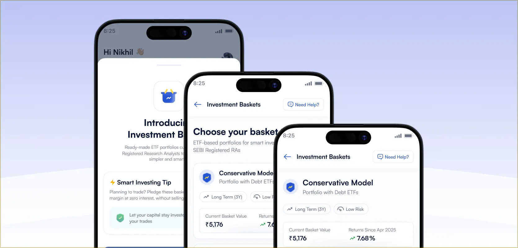
Investment Baskets

Curated ETF baskets users can buy in the app, then pledge for a second return.